Website Design with Material Design
Back in June at the IO event Google announced the Material Design guidelines. This was a full set of design and style guidelines or at least recommended guidelines for mobile and android apps, they came up with this best practice document for building apps that work well and that people will enjoy using.
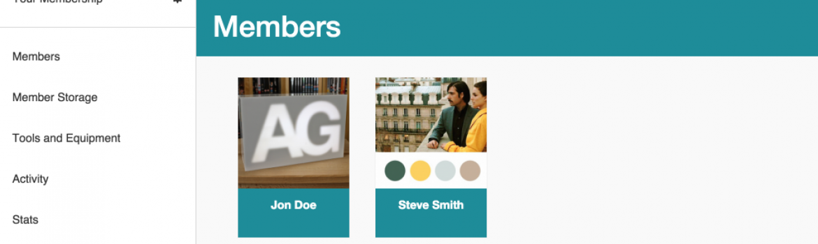
I have recently built the member site for Build Brighton and for the interface I used Bootstrap as it was something I was familiar with and more importantly it was a very quick way to get started. Now that the site was built and being used I decided to take a look at a redesign based on the material design guidelines.
By using bootstrap the site was responsive and worked to some extent on a mobile device but it did have some issues, I also had problems with the size of the menu and placement of key action buttons.
Redesigning the site took about two weeks spending the odd day here and there but it was a success. The big change was the menu moving from the top of the site to the side, this means that the menu can scroll accommodating many more items than the top menu could and it also collapses away on smaller screens. On those smaller devices I show the hamburger icon when collapsed which has become synonymous with the menu so users immediately know where to go to navigate the site.
By following these design patterns I am aiming to reduce the cognitive overhead of using the site by which I mean users hopefully just know how to use things. A user won't need to think about where to go to find something as they will already be familiar with the general layout and structure from using other websites and apps.
The large headers and blocks of colour introduced with the design also give me a canvas for experimenting with more visually appealing designs and importantly for me the scrolling menu can accommodate are growing set of features.